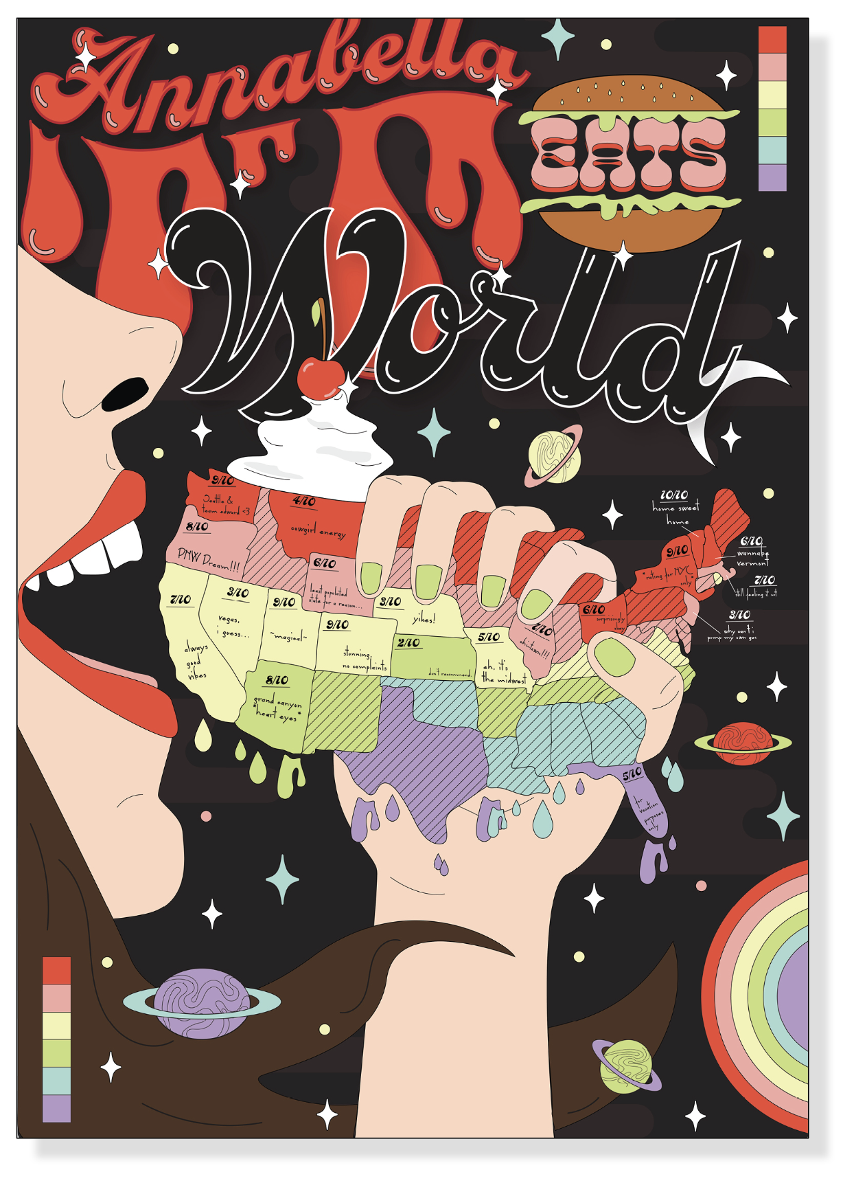
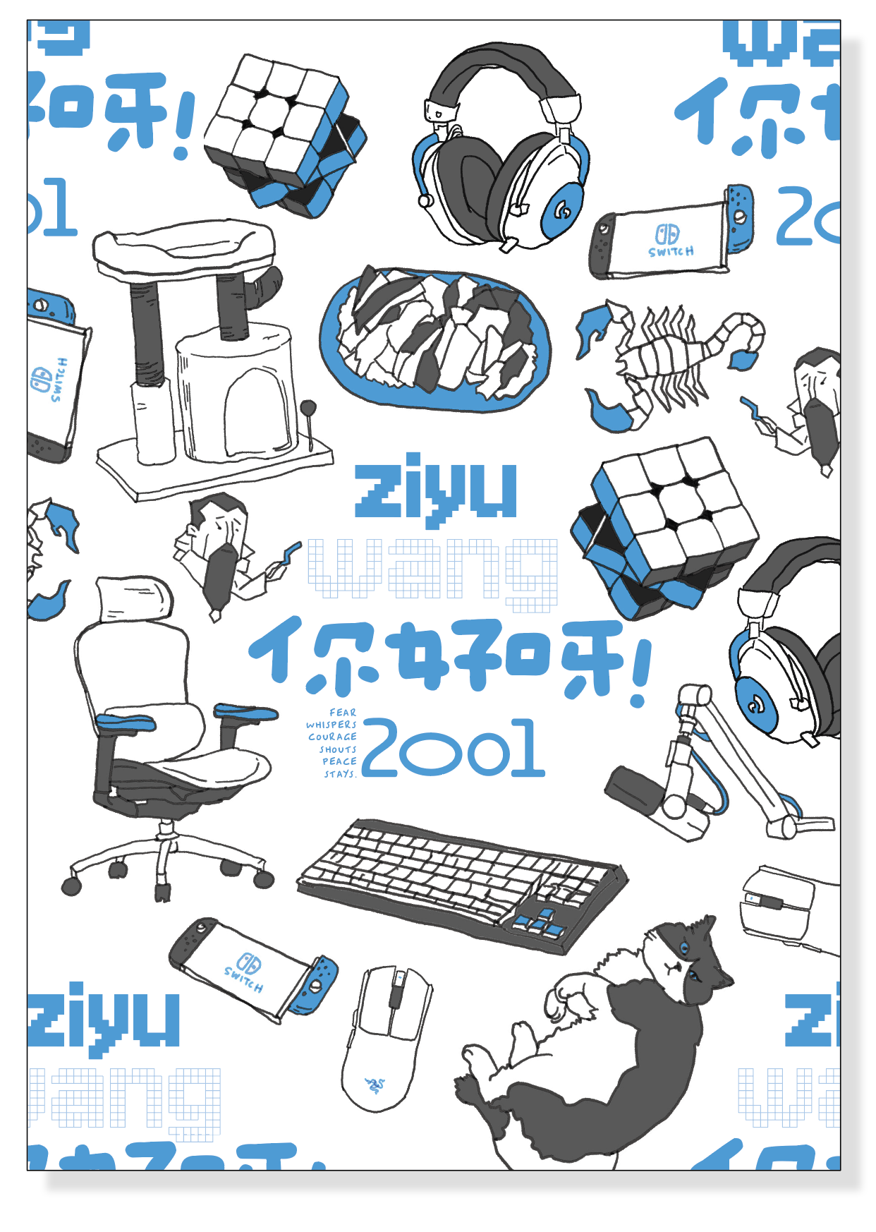
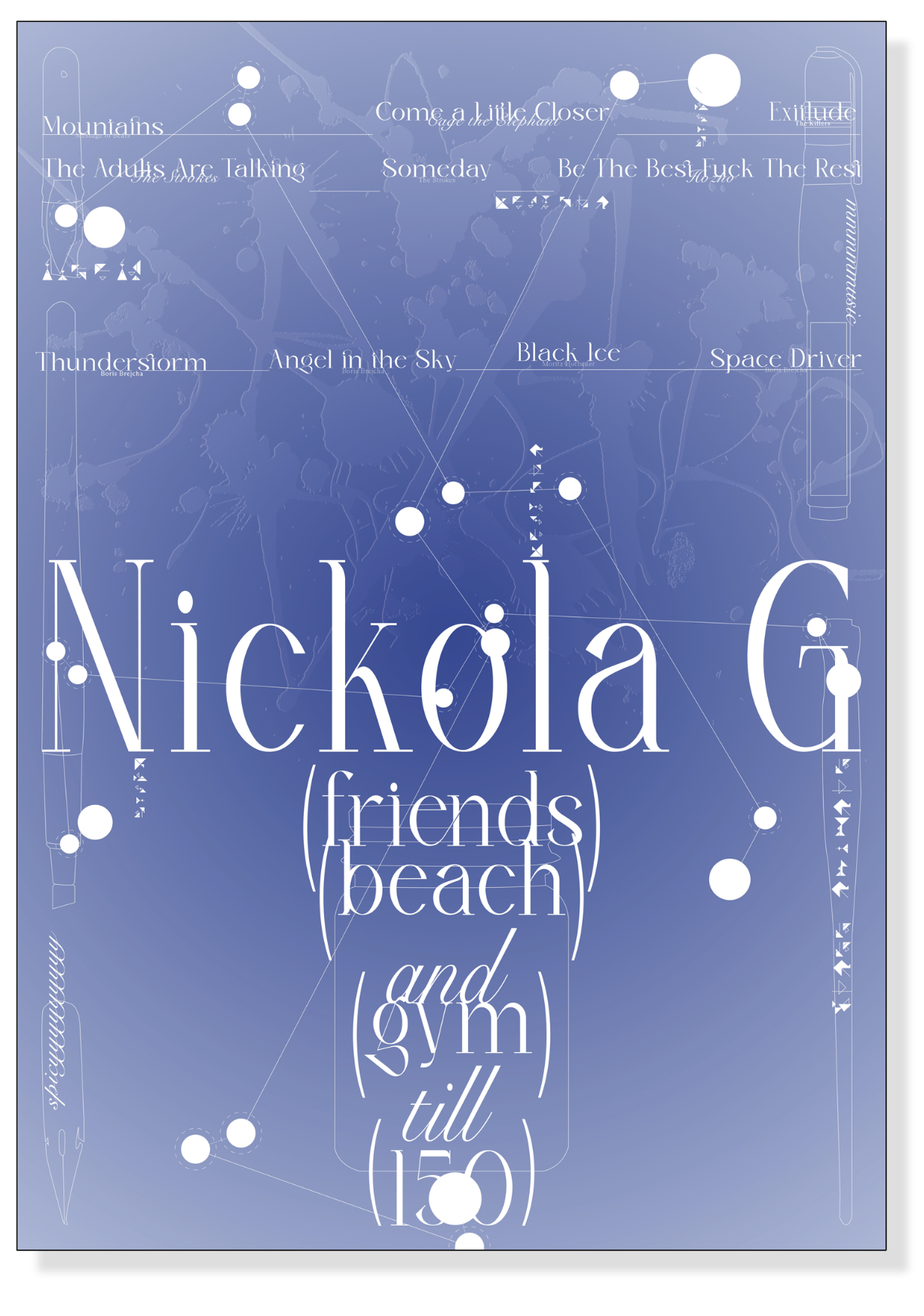
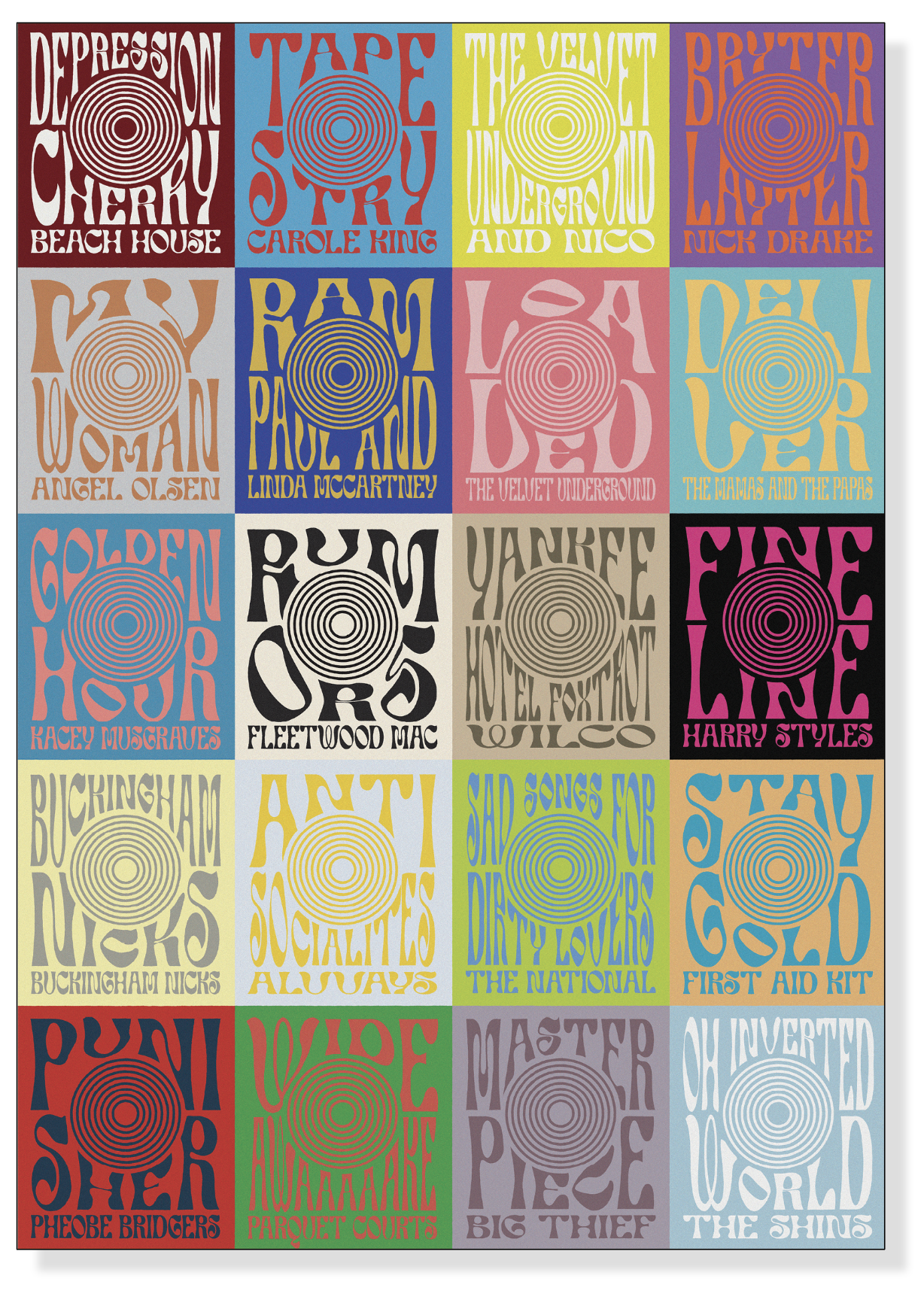
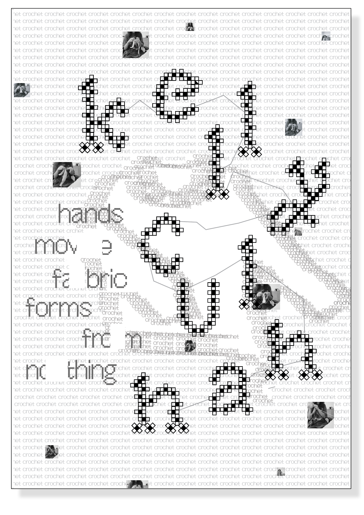
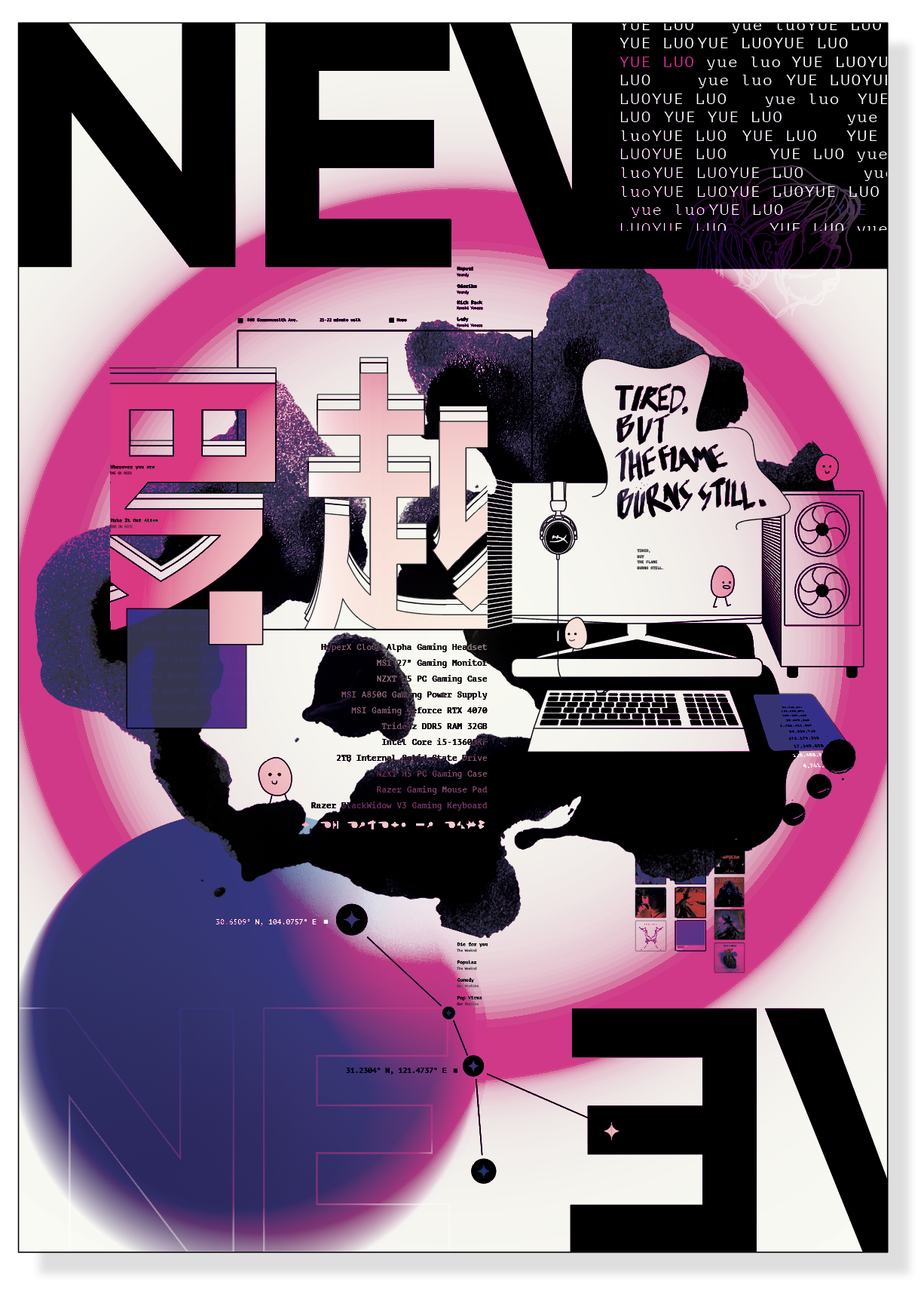
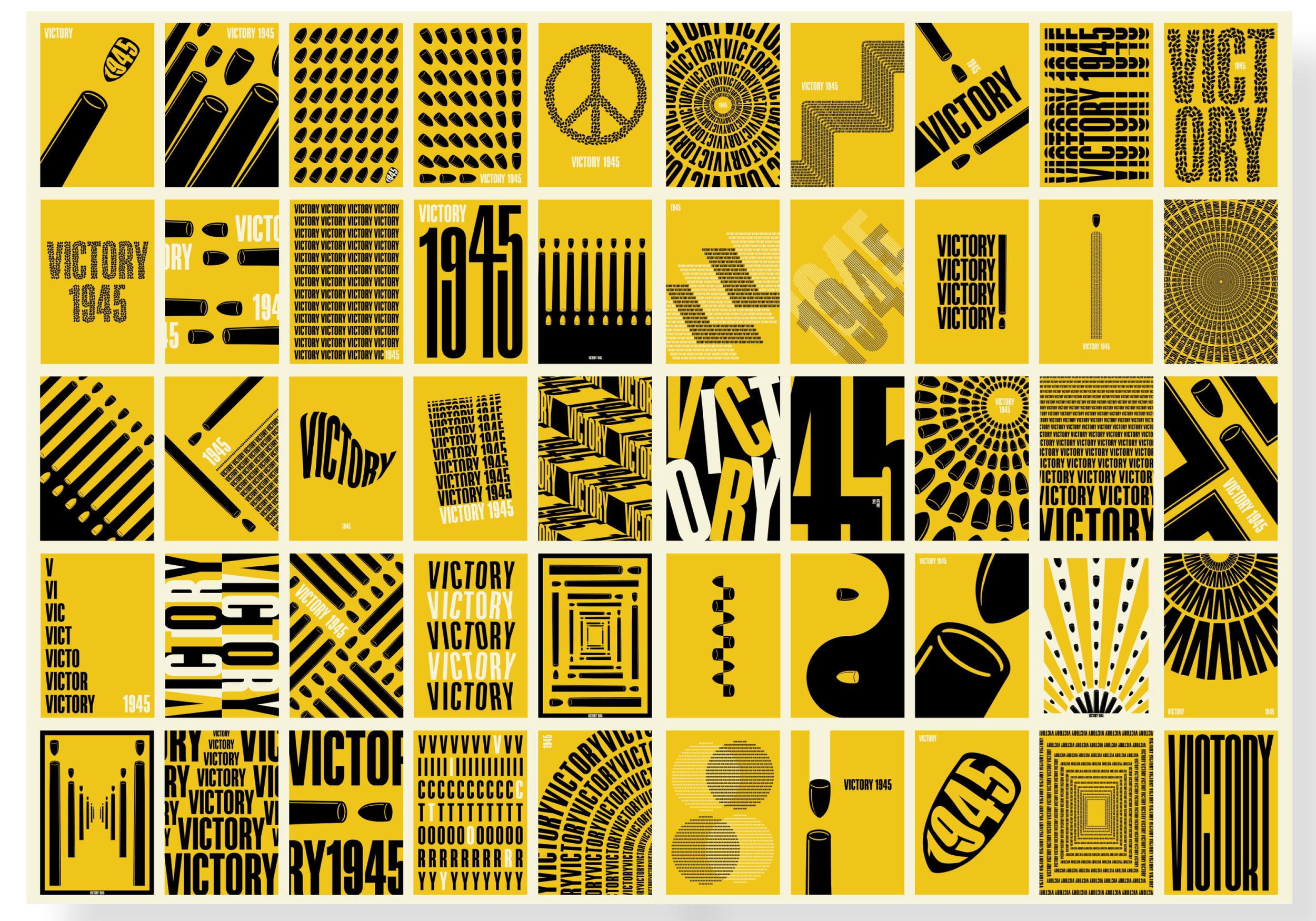
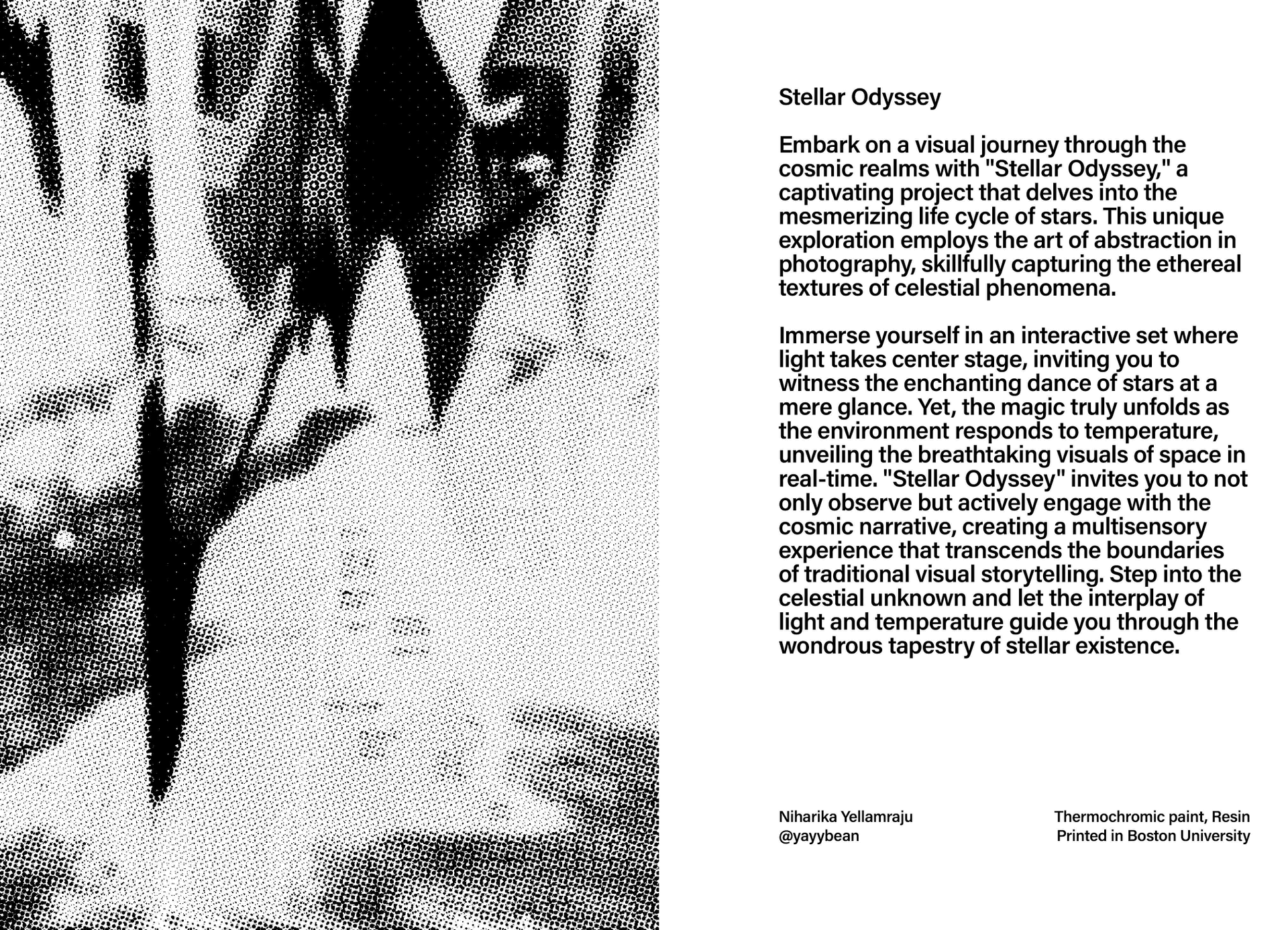
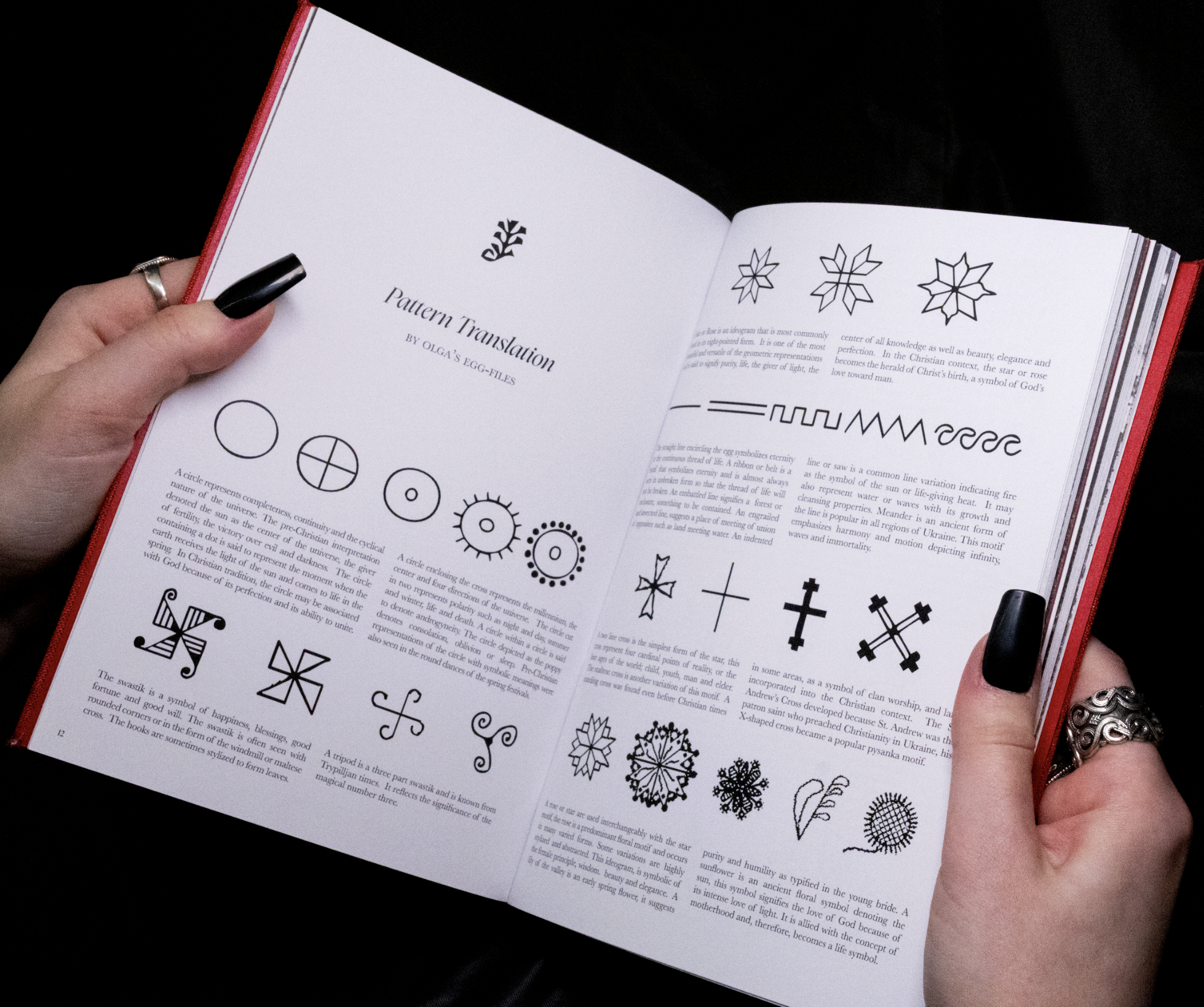
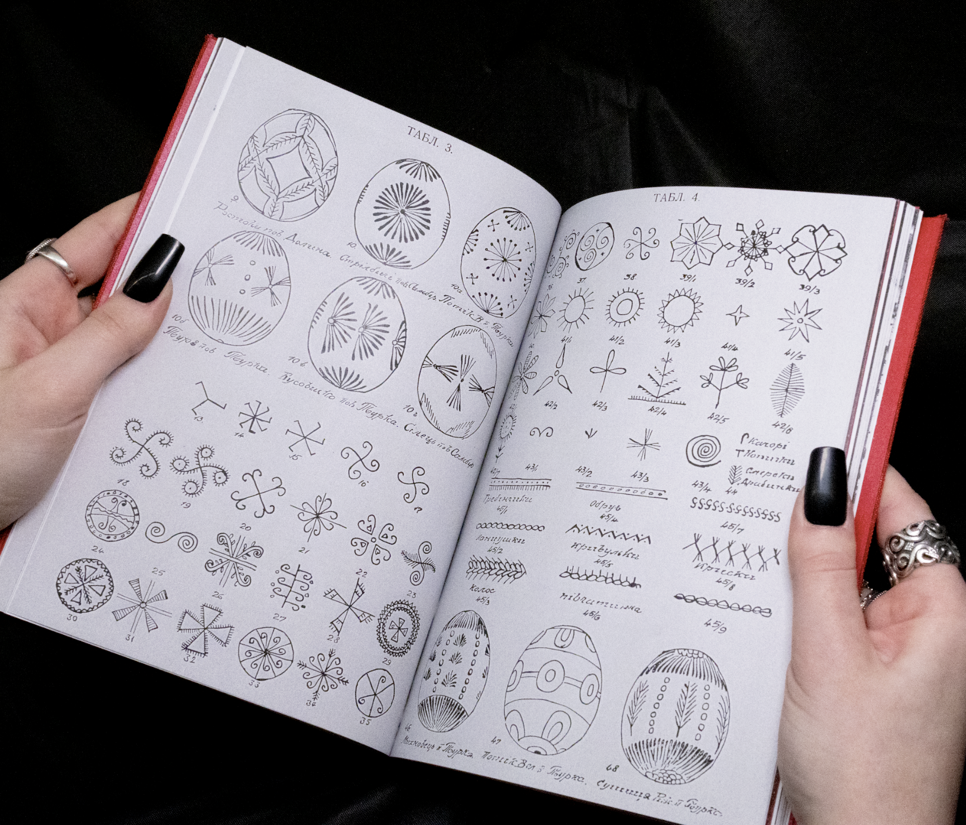
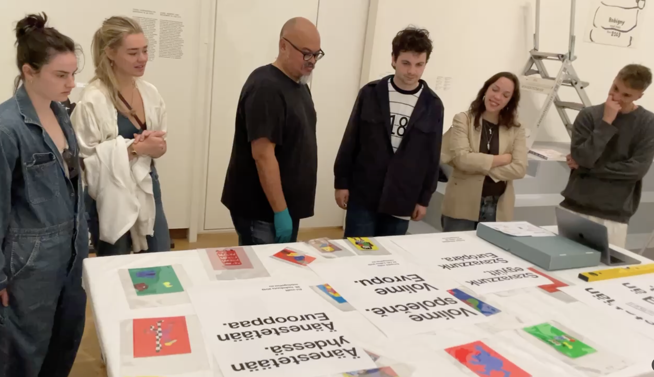
This collection features a series of information design projects in which students translated complex and/or quantitative data into clear, visually structured formats. Each project required students to research, analyze, and synthesize dense information—such as statistical data, systems, processes, timelines, or multi-variable comparisons—and transform it into accessible visual communication.
Students employed a range of strategies including data visualization, diagramming, mapping, charting, and hierarchical structuring. Emphasis was placed on accuracy, clarity, legibility, and the relationship between form and content. Projects demonstrate careful consideration of scale, typography, color systems, labeling conventions, and visual logic to ensure that information is both precise and comprehensible.
Together, the collection highlights students’ ability to distill complexity, identify patterns and relationships within data, and construct visual frameworks that support analytical thinking and audience understanding.